EN
EN
 AR
AR
 BG
BG
 DA
DA
 NL
NL
 FI
FI
 FR
FR
 DE
DE
 IT
IT
 JA
JA
 KO
KO
 NO
NO
 PT
PT
 RU
RU
 ES
ES
 IW
IW
 TH
TH
 MS
MS
 HY
HY


The Psychological Impact of Color in Chocolate Packaging Design
Why Color Choices Matter in the Chocolate Industry
Color choices play a crucial role in attracting consumers and influencing their purchasing decisions in the chocolate industry. A vivid illustration of this is shown in studies where approximately 85% of consumers make buying decisions based solely on color. Such subconscious judgments are often made within 90 seconds of initial viewing, highlighting the profound impact color has on consumer behavior. Different colors evoke distinct emotions and convey various messages, especially vital in chocolate marketing. Dark hues, like deep browns or blacks, may imply richness and luxury, while vibrant tones, such as reds and oranges, may communicate fun and playfulness. Recognizing these nuances helps brands position their products more effectively on store shelves.
Moreover, understanding the psychological effects of color is essential for global chocolate brands to tailor their packaging designs to specific regional preferences. For instance, while green might suggest health and natural ingredients in one culture, it could have a different connotation entirely in another. This cultural variance makes it essential that brands always consider regional perceptions to ensure a universally appealing design.
Emotional Responses Triggered by Strategic Color Use
Strategic color use in packaging can elicit specific emotional responses from consumers, enhancing a chocolate product's perceived value. For instance, colors such as red and gold are traditionally associated with indulgence and luxury, making them ideal choices for high-end chocolate packaging. The psychological impression of these colors can effectively enhance the anticipation around a chocolate brand, subtly suggesting a premium experience. Marketing research also finds that color influences flavor perceptions; a chocolate bar in blue packaging might unintentionally suggest a minty flavor, showcasing how color strategically molds consumer expectations.
Brands can harness the power of color psychology to craft persuasive narratives about their products, integrating color as a critical storytelling element. By understanding emotional psychology, chocolate brands can create cohesive packaging stories that resonate with consumers, evoking desired emotional responses and prompting purchases. This strategic alignment of packaging elements can differentiates a product in a competitive market, fostering a deeper connection with the target audience through carefully curated color experiences.
Aligning Color with Brand Identity in Boutique Chocolate Packaging
Reflecting Brand Personality Through Color Selection
Color selection plays a pivotal role in conveying brand personality in boutique chocolate packaging. Unique and unconventional colors allow boutique chocolatiers to establish a distinct identity in the crowded chocolate market. For instance, brands like Vosges use exotic color palettes to evoke luxury and sophistication. On the other hand, some brands opt for earthy tones that signal organic or artisan qualities, resonating with consumers who prefer natural and handcrafted products. Consumers are more likely to connect emotionally with brands maintaining a consistent color story, which in turn builds customer loyalty and facilitates easy recognition. This makes color a crucial element in establishing a memorable brand identity in the competitive world of chocolate.
Target Market Preferences and Cultural Color Associations
When selecting colors for chocolate packaging, understanding the target market's preferences and cultural associations is essential. Different demographics express color preferences shaped by factors like age, cultural background, and economic status. Research indicates that colors hold varied meanings across cultures; while white is associated with purity in Western societies, it can symbolize mourning in some Eastern cultures. By tailoring color schemes to align with the preferences of the target market, brands can not only enhance the product's appeal but also forge a deeper brand connection with the consumer. This approach helps in crafting a color narrative that resonates across different cultural contexts, ultimately supporting the success of the boutique chocolate brand.
Color Psychology Strategies for Premium Chocolate Packaging
Warm Tones: Conveying Indulgence and Luxury
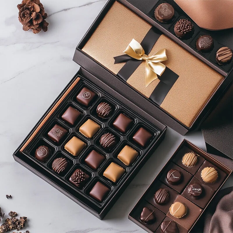
Warm colors like reds, oranges, and golds play a crucial role in chocolate packaging by conveying indulgence and luxury. These colors evoke strong emotional responses such as warmth and satisfaction, making them ideal for premium chocolate brands that aim to highlight the richness of their products. For instance, the visual impact of these hues can persuade customers, especially in upscale retail settings, to make impulse purchases, thereby boosting sales. Studies have shown that consumers are often attracted to packaging that reflects warmth and comfort, creating a sense of indulgence even before tasting the product.
Warm colors are particularly effective in creating an impression of premium quality and exclusivity, akin to the feeling generated by high-end confectionery. Companies utilize these colors strategically to enhance the perception of their chocolates, making the products appear more luxurious and desirable.
Cool Hues: Emphasizing Freshness and Natural Quality
Cool hues such as blues and greens suggest freshness and natural quality, which appeals predominantly to health-conscious and eco-friendly consumers. Chocolatiers striving to position their brand within the eco-friendly space often adopt these tones to align with the sustainability-driven values of their target market. Using cool colors can evoke a sense of authenticity, reinforcing the chocolate's wholesome appeal and commitment to quality.
Incorporating blue and green into packaging can also foster tranquility, offering a serene yet sophisticated look that enhances the perception of the chocolate as a fresh and premium product. Brands like boutique chocolate makers can tap into the Boutique Chocolate Packaging trend, using such hues to stand out while cultivating consumer trust and connection.
Designing Visually Striking Chocolate Packaging Through Color
Contrast Techniques for Enhanced Shelf Visibility
High-contrast color combinations are vital in ensuring that chocolate products stand out on crowded retail shelves. Using contrasting colors not only captures the consumer's eye but also enhances the visibility and recognition of the product. For instance, the interplay of dark and light shades can effectively emphasize brand logos and essential product details, aiding in immediate consumer recognition. According to a report by Graphic Packaging International, employing high-contrast strategies can boost the product's shelf impact by as much as 80%. This makes it a crucial technique for brands aiming to increase their visibility and attract potential buyers quickly.
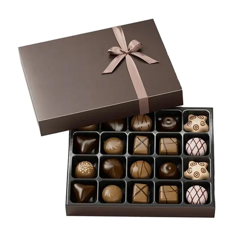
Harmonizing Color Schemes for Cohesive Luxury Aesthetics
Creating a harmonious color scheme is essential for ensuring a luxurious and sophisticated look for premium chocolate packaging. By selecting colors that naturally complement each other, brands can guide consumers' eyes seamlessly across the packaging, reducing visual clutter and enhancing overall appeal. This can reinforce brand identity, presenting a cohesive narrative that communicates luxury and quality. Tools such as the color wheel are invaluable for designers when choosing palette combinations that resonate with brand values. These refined color choices not only appeal to discerning luxury consumers but also help position the chocolate as an indulgent and high-end product.
Innovative Color Trends in Modern Chocolate Packaging Design
Minimalist Color Palettes for Contemporary Appeal
Minimalism is increasingly becoming a hallmark of modern chocolate packaging design, primarily characterized by the use of limited color palettes. By focusing on fewer colors, brands emphasize the product's quality rather than relying on vibrant, busy designs. This streamlined approach not only elevates the aesthetic value but also allows the product to occupy a sophisticated niche in the market. Research has shown that minimalist packaging can boost perceived product value by up to 20%, positioning it as a favored strategy for premium brands seeking contemporary appeal. By choosing minimalist designs, brands can convey a sense of luxury and exclusivity, attracting a discerning consumer base.
Sustainable Materials Influencing Color Choices
The growing emphasis on sustainability is also influencing color choices in chocolate packaging design. As brands shift to eco-friendly packaging materials, the interaction between color and these materials becomes crucial. Traditional dyes may be less applicable, prompting the exploration of natural alternatives. This drive for sustainability not only requires creativity but also offers an opportunity to appeal to environmentally conscious consumers. Adopting sustainable color sourcing techniques reinforces a brand's commitment to eco-friendly practices and strengthens its identity in an increasingly conscientious market. Embracing this transition can enhance brand loyalty and attract customers who prioritize sustainability in their purchasing decisions.
FAQ Section
Why is color important in chocolate packaging design?
Color plays a pivotal role in attracting consumers and influencing purchasing decisions. Specific colors can evoke emotions and convey messages, thereby affecting consumer perception and enhancing product appeal.
How do colors in packaging influence consumer emotions?
Colors can trigger specific emotional responses that enhance a product's perceived value. For example, red and gold are often associated with indulgence and luxury, subtly suggesting a premium experience.
What role does color play in aligning brand identity for boutique chocolate brands?
Color helps convey brand personality, allowing boutique chocolatiers to establish a distinct identity. Consistent color themes enhance customer loyalty and facilitate recognition in a crowded market.
How do different markets perceive color in packaging?
Cultural associations significantly affect color perception, necessitating tailored packaging designs for different target markets to enhance appeal and connect with consumers on a deeper level.
How can sustainable color choices impact chocolate packaging design?
Sustainable color choices, using eco-friendly materials and dyes, can appeal to environmentally conscious consumers and reinforce a brand's commitment to sustainability, enhancing consumer loyalty.
Table of Contents
- The Psychological Impact of Color in Chocolate Packaging Design
- Aligning Color with Brand Identity in Boutique Chocolate Packaging
- Color Psychology Strategies for Premium Chocolate Packaging
- Designing Visually Striking Chocolate Packaging Through Color
- Innovative Color Trends in Modern Chocolate Packaging Design
-
FAQ Section
- Why is color important in chocolate packaging design?
- How do colors in packaging influence consumer emotions?
- What role does color play in aligning brand identity for boutique chocolate brands?
- How do different markets perceive color in packaging?
- How can sustainable color choices impact chocolate packaging design?